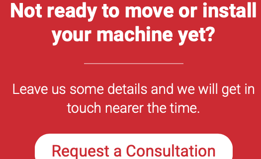
If you are a business that is looking to improve your website or would like to convert your website traffic into new enquiries, then perhaps you need to reconsider how you are utilising your call to action (CTA) buttons.
In this article we share our top tips on how to use call to action buttons on your website.
So, for those that are unaware, a CTA button is something that prompts website visitors to perform a specific action. This could be to learn more about the history of your business or your products and services, sign up to an event you are hosting or to download a free guide you have created. The sole purpose of CTA’s are to help you convert your website traffic.
Fun fact……only 55% of website visitors spend fewer than 15 seconds on your website.
What words should I use in my CTA?
When creating your CTA, you should remember to use actionable copy. Where possible avoid using words that force the viewer to do something. Replace words such as “Download”, “Buy”, “Order” and “Submit” where possible.
Instead, our recommendations would be to use the following.
- Learn more
- Get started
- Register today
- Send me a copy
How to test a CTA button
When creating your Call-to-action button, in our opinion there are six key components that you need to take into consideration during the design phase.
- Colour – Do you stick with your brand colours or go with something that is bold and eye catchy?
- Text – Where possible please to use the same font used across your entire website to ensure uniformity.
- Placement – A CTA should not be an afterthought, so consider where to place your CTA, so it is in a visible position.
- Shape – This is down to personal preference, but you could opt for a rectangle, circle or even triangular CTA button
- Size – This is a very important element to consider, as a CTA that is too big could appear obnoxious or arrogant, but one that is too small might not be visible enough.
- Imagery – Incorporating imagery into CTA presents you with a more visible button that is more likely to be clicked. Just ensure the image you use is relevant to what you want to user to do on your website.
What metrics should I use to track my CTA?
In order to tailor your CTA’s, you first need to monitor their performance to see what works and what doesn’t.
When working with our clients, the most important metric we track is the click through rate. This measures the percentage of people that clicked your CTA button versus those that didn’t.
Examples of good CTA’s
When testing your CTA’s it’s important to remember that there isn’t a one size fits approach you can adopt. What works for one website might be the wrong approach for another. Some might find instant success, and some might have to tailor their CTA’s in order to find the right formula over a prolonged period. Tools such as Google Analytics in which you can also set specific goals will help track performance and software such as Lucky Orange will help you understand how visitors navigate around your website and what actions they do and don’t take on specific pages so you can improve engagement and results.
This is where it is important to seek professional advice to help you avoid wasting time and money.
Finally, whilst not technically a call to action button, having a chat facility on your website may also improve engagement and enquiry conversion as they are a great way to start a conversation with visitors and answer questions.
At Simple Marketing Consultancy, we have a proven track record of working with our clients to help them convert their website into new enquiries.
If you would like help improving the performance of your website, please don’t hesitate to get in touch.


